BRAND IDENTITY
Aissessai
Athleisure Clothing Brand


The Drawing Board
First Drafts
The Final Identity
The Brief
Aissessai is an athleisure clothing brand inspired by the Greek word "aisthesthai," meaning "to perceive." The brand aims to intertwine the founder's Asian heritage with a blend of East meets West aesthetics. A unique fusion combining the elegance and minimalism characteristic of Asian design with the modern, dynamic elements of Western fashion.
The Kreative Lab was tasked to create a brand identity that includes a Logo, Colour palette and a small typography guide.
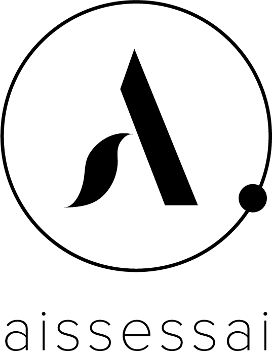
Through iteration, we have reached the final chosen identity for aissessai. The first draft of the logo was evolved and made cleaner and more minimal. We kept the brand name in small case letters to bring a sense of balance and symmetry to the name.
With this in mind, we’ve mirrored this to the logo while still retaining it’s symbolism of perception and infusion of the founder’s Asian heritage. Below are a selection of pages from the style guide: Quick typography guide, logos and sample asset execution.


The overlapping linear circle and smaller circle symbolize an eye, representing “perception”. At the center, the letters 'a' and 's' are cleverly integrated to form an abstract shape of a person in a yoga pose.

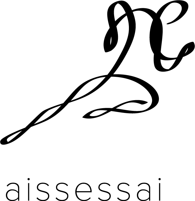
Inspired by the contour line drawing of a person running, the lines are arranged in a way that evokes the appearance of Asian characters, infusing the logo with a sense of Asian heritage in a dynamic way.


